Website resource library design that helps people find a usable item
Plan website resource library design around reader tasks, useful item details and maintainable categories so visitors can find a relevant guide rather than browse an unexplained file store.
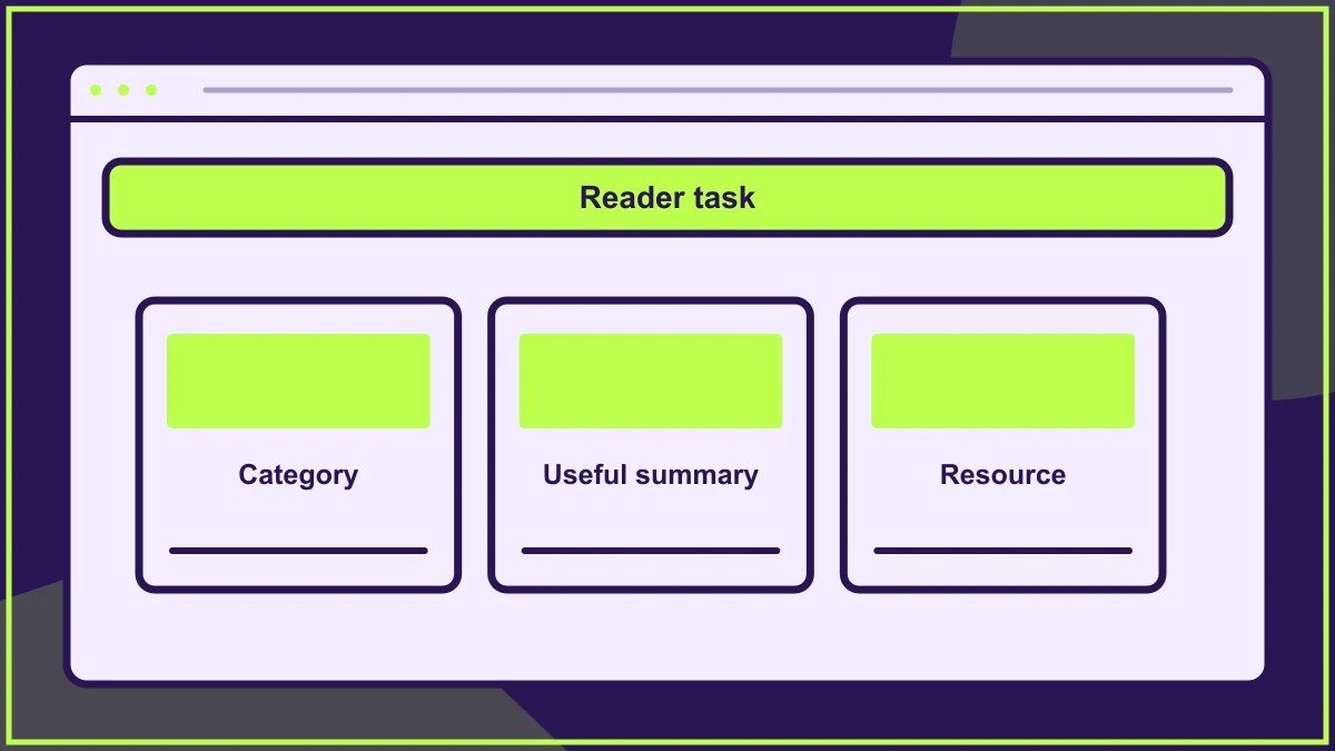
Website resource library design should help someone find a relevant item and understand whether it will be useful before opening it. Start with the questions visitors bring, then organise the collection around those tasks. A folder full of attractive download cards can still be difficult to use if every item has an unexplained title and the same generic icon.
A library may contain guides, forms, recordings or other material, but the variety should not dictate the structure by itself. The visitor usually needs an answer or a tool for a task, rather than a tour of the organisation's preferred file formats.
Establish the collection's purpose
Describe who the library serves and what they should be able to accomplish. A technical support collection and a public learning collection may need different descriptions, grouping and routes. Mixing them without explanation can make relevant material harder to recognise.
Review a sample of real enquiries and existing resources. Identify the terms readers use and the decisions they need to make. Avoid creating categories solely from internal teams if visitors would not know which department owns their question.
The guide to designing around customer questions helps turn that evidence into an understandable collection structure.
Give every item enough context
Include a descriptive title and a short explanation of what the resource helps someone do. Add useful details such as format, audience or a meaningful revision date where they affect the choice. Do not make readers open several files merely to discover which one applies.
In a hypothetical community organisation, a volunteer induction guide and a venue-hire checklist may both be PDFs. Their shared format is less useful as a primary grouping than the different tasks they support. The card should make that difference visible.
Use categories that editors can maintain
Choose a small set of categories with clear meanings and test them against a realistic range of items. If editors cannot decide where a resource belongs, visitors may struggle to predict where to look for it too.
Document the rule for material relevant to more than one task. A consistent primary category with additional contextual routes may be clearer than copying the same file into several places. Keep the published resource and its revision history under understandable ownership.
Introduce filters only when they help a real choice
A large collection may benefit from filters, but every control should help visitors narrow the material meaningfully. A format filter can be useful where someone needs a printable form, while a subject filter may be more valuable for general learning.
Test the combination with real labels and counts. Avoid presenting filters whose options are mostly empty or indistinguishable. If a small collection can be browsed comfortably, a well-structured page may be simpler than a complex filtering interface.
Plan search alongside browsing
Consider the words visitors will type and the information shown in results. A resource's internal filename may not contain the phrase a reader expects. Titles, summaries and appropriate content indexing need to support the search task.
Keep the empty-result route useful. Preserve the query and help the visitor broaden it or choose a relevant section. The guide to empty state design helps plan that moment without presenting a blank collection as though nothing can be done.
Make the next action explicit
Distinguish opening a resource page, downloading a file and watching a recording. The visual treatment should help readers predict the action. Avoid using an arrow icon alone where the destination could behave in several different ways.
Check the experience on a phone and with keyboard navigation. Long titles, repeated controls and file details should remain readable when cards stack. If the resource opens in a different application or window, consider how that behaviour is communicated appropriately.
Design for updates and withdrawal
Assign responsibility for each item's accuracy and review. A library can accumulate outdated versions because adding material feels easier than removing or replacing it. Decide how editors mark a superseded resource and guide visitors towards the current one.
The design handover checklist helps document the component's content fields and editorial rules. Include the decision about whether a withdrawn item needs an explanation or an alternative route, rather than leaving a broken destination.
Test finding one specific resource
Give a reader a realistic situation and ask them to locate an appropriate item. Watch how they interpret categories, which details they compare and whether they understand the action available. Ask them to explain why the selected item fits their task.
Use the observation to improve labels and summaries before adding visual complexity. A successful library makes useful material discoverable and keeps its context clear. Its value comes from the connection between the reader's need, the selected resource and a supported next step.
Frequently asked questions
Should a resource library be organised by file type?
Use file type where it helps the task, but do not assume it is the visitor's primary question. Subject, audience or activity may provide a more useful route into the collection.
Does every resource need a separate landing page?
Not always. Consider whether the item needs context, version information or related guidance. Choose a pattern that helps readers understand and maintain the resource without creating unnecessary steps.
When should filters be added?
Add them when a meaningful collection and real reader task justify the controls. Test whether each filter narrows the choice usefully, rather than adding them because library pages commonly have them.
HELP US IMPROVE
Was this article useful?
Your feedback helps shape future coverage.