Website notification badges with a clear meaning and next step
Design website notification badges around a specific count or state, with clear scope and a useful destination so a small visual marker does not create unnecessary uncertainty.
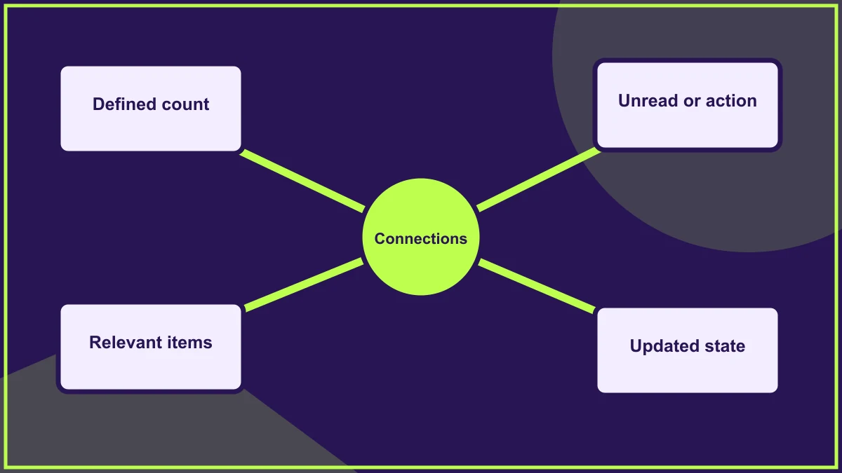
Website notification badges should represent a specific count or state that the visitor can understand and act on. Decide what the marker means before choosing its colour, size or position. A small number beside an icon can attract attention while leaving people uncertain whether it describes unread information, outstanding tasks or something else.
The component needs an agreed relationship with the underlying content. Opening a panel, reading an item and completing a task are different events. The visual state should reflect the appropriate event rather than changing in whichever way is easiest to implement.
Define exactly what is counted
Write a sentence describing the badge's meaning. "Three unread messages" is different from "three messages in total" or "three tasks requiring action". Keep the definition consistent across the interface and the team's operating process.
For a hypothetical customer portal, a badge might count documents that still need review. If it instead counts every document ever received, the same prominent marker could suggest unfinished work where none exists. The visitor should not need to open the collection repeatedly to discover which interpretation applies.
Connect the marker with a useful label
An icon alone may not explain what the badge refers to. Keep the relationship with the relevant navigation item or control clear, and make the fuller meaning available through an appropriate text label or accessible description.
Avoid relying only on colour. A red dot can mean urgency, an unread state or simple presence in different interfaces. Pair the treatment with a defined message or task so readers are not forced to decode the organisation's visual convention.
The guide to visual hierarchy helps decide whether the badge deserves strong emphasis in relation to the current page task.
Choose the event that changes the state
Agree what happens when a person opens the destination, views an individual item or completes the required work. A task badge should not disappear merely because its panel was opened if action is still outstanding.
The reverse can also confuse people: an unread marker that remains after the item was read may suggest that the change did not save. Define the rule with the developer and test a return visit, rather than judging the state only during a single uninterrupted session.
Handle zero and large counts deliberately
Decide whether an empty count is hidden, shown as zero or represented another way. The choice should help the visitor distinguish a complete task list from unavailable information. A failed count request should not quietly look like a confirmed absence of work.
For large collections, a shortened count may be appropriate, but make its meaning understandable. Avoid presenting a precise-looking number if the system is only displaying a threshold or an estimate. The visual shorthand should not create a false sense of exactness.
Consider urgency separately from quantity
A single important action may deserve more attention than many routine updates. Do not assume the largest count is the most urgent task. If severity matters, define it through a separate, understandable content or status treatment.
Keep the number of competing badges proportionate. A navigation bar covered in bright markers can make the main task harder to identify. Review which notifications genuinely help the visitor and which mainly advertise that content exists.
Make changes understandable without disruption
If the count changes while the person is using the page, consider how that information is communicated appropriately. Ask the developer to provide a suitable accessible status treatment where the change needs to be announced without moving focus.
Avoid unnecessary repeated interruptions for ordinary background updates. The goal is to make a meaningful change available to the user, not to announce every minor recalculation. Include the behaviour in appropriate accessibility testing rather than treating a visual number update as sufficient.
Preserve the route into the relevant items
Selecting the control should lead to content consistent with the badge. If the marker describes outstanding items, make those items easy to find. A general dashboard that hides the relevant work creates another search task after the visitor responds to the notification.
Use the guide to empty states to plan what happens when the final item is completed or disappears. The destination should explain the current state rather than leave an unexplained blank area.
Test the state over a complete cycle
Create a realistic item, observe the badge, open the destination and perform the relevant action. Leave and return, then check the count again. Repeat with no items, several items and a retrieval failure where a controlled test supports it.
Include the cycle in design quality assurance, with keyboard operation and narrow layouts. A useful badge connects attention to a clear reason and an appropriate next step; it should reduce uncertainty rather than manufacture an obligation the visitor cannot interpret.
Frequently asked questions
Should every new item create a badge?
No. Decide whether the marker supports a meaningful reader task. Too many persistent badges can make it difficult to distinguish useful notifications from routine background content.
Should opening a panel clear the badge?
Only if that matches the defined meaning. An unread state may change on viewing, while an outstanding task should normally reflect whether the required action has actually been completed.
Can a badge communicate an error loading the count?
It needs a deliberate treatment for that situation. Avoid showing a confirmed zero when the system does not know the current count, and provide a suitable explanation or recovery route.
HELP US IMPROVE
Was this article useful?
Your feedback helps shape future coverage.