Website focus-state design across light and dark surfaces
Plan website focus-state design across buttons, links and layered surfaces so keyboard users can see their current position throughout a realistic page task.
Website focus-state design helps a person see which interactive item is currently controlled by the keyboard. Plan the indicator across the actual components and backgrounds in the site, rather than approving one outline on a plain demonstration page. A visible state needs to remain understandable as the visitor moves through links, buttons, forms and layered content.
This is a complete interaction concern as well as a colour choice. The indicator, the focused item and the surrounding layout work together. Ask the developer and appropriate accessibility testers to review the implemented behaviour, with the design providing clear examples and intent.
Start with the interactive component inventory
List the controls a visitor encounters on a realistic journey. Include ordinary text links, navigation items, form fields, image links and custom components. A focus treatment that works for a rectangular button may not work for a small inline link.
Check which components already have a useful browser-provided state and which custom styles alter it. Avoid removing an indicator merely because it differs from the visual mockup. The design needs to preserve an understandable current position throughout the task.
The guide to accessible design questions helps place this work within the broader commissioning and review process.
Test against the real surfaces
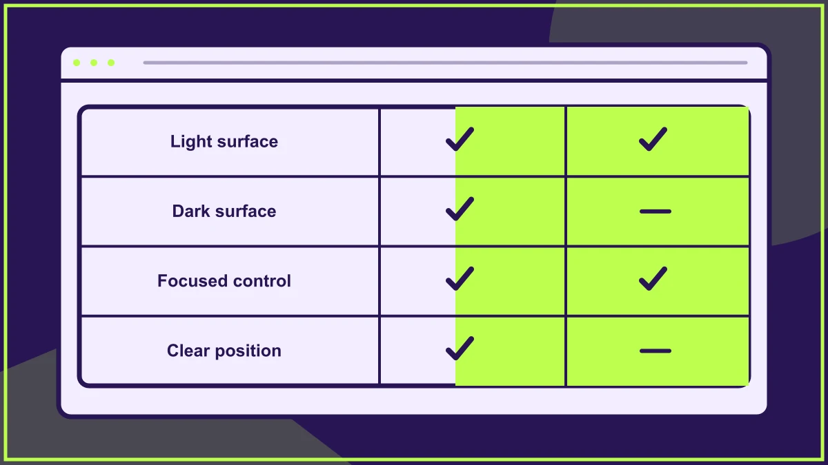
Show the state on light and dark backgrounds, accent-coloured panels and any photographic areas that contain controls. A single brand colour can become difficult to see against some of these combinations.
In a hypothetical visitor attraction site, a booking link may appear in the white main content and again over a dark image panel. The same thin outline could be clear in one location and disappear in the other. The solution needs to account for the relationship with each surface.
Use a recognisable visual language
Choose an indicator that is distinct from hover, selection and validation states. A visitor should not have to infer whether a coloured field is focused, contains an error or has been chosen as an option.
Consistency helps, but it does not require forcing exactly the same geometry onto every control. An outline, underline or combined treatment may need to adapt to the component while preserving a recognisable purpose. Document the variations rather than leaving each one to individual interpretation.
Keep the focused item in view
Check the relationship with sticky headers, fixed notices and overlapping panels. A strong indicator cannot help if the control itself is hidden behind a layer. Follow keyboard focus through a long page and through any change that moves the viewport.
The guide to visual hierarchy helps define the relationship between persistent controls and page content. Test in-page navigation and form errors too, because moving directly to a destination can place it beneath persistent content.
Preserve shape and spacing
An indicator should not make surrounding content jump unexpectedly. Review how borders, outlines and spacing interact with the component's dimensions. A state that moves a nearby action can create confusion at the moment someone is trying to select it.
Also check clipping. Card containers and decorative wrappers may cut off an outline drawn outside a control. The screenshot should show the full implemented state, including at the edges of a grid or a narrow layout.
Check the sequence rather than isolated controls
Use the keyboard to move through an actual task and observe the visible position at every step. A component library can contain good examples while the page combines them in an unexpected order or includes a control with no clear indicator.
Ask whether the next item is predictable and whether the current state remains visible for as long as it is relevant. Avoid effects that appear briefly and fade away while the person is still deciding what to do.
Include text enlargement and narrow screens
Review the state when labels wrap, controls grow taller and the layout changes. A treatment designed around a single-line button may become awkward when the text occupies several lines. The focus cue should remain connected to the correct item.
Use the responsive design guide to choose practical test conditions. Include the page's shortest useful height, where fixed elements and the on-screen interface can leave less room for the active control.
Hand over the state as part of the component
Provide examples, background combinations and notes about related states. Make the intended treatment visible in design review rather than leaving focus styling to a final tidy-up after the visual work is approved.
Record any implementation issue and retest the actual route after correction. The useful result is that someone navigating without a pointer can keep track of the current control and continue the task with confidence. Decorative consistency should support that outcome, not replace it.
Frequently asked questions
Is a hover effect enough to show keyboard focus?
No. Hover describes a pointer position, while keyboard focus identifies the current interactive item. The implemented interface needs an appropriate visible state for keyboard operation.
Can one focus colour work everywhere?
It may, but check it against every relevant surface and component state. Light, dark and image-backed areas can require an adapted treatment to keep the current position understandable.
Why can a good-looking focus outline still fail in a page?
The page may clip it, cover the focused control or combine states ambiguously. Test the full journey and layout rather than judging the indicator only in an isolated component example.
HELP US IMPROVE
Was this article useful?
Your feedback helps shape future coverage.