Designing forms people can actually complete
Usable forms ask only necessary questions, keep labels clear and help visitors recover from errors before confirming the result.
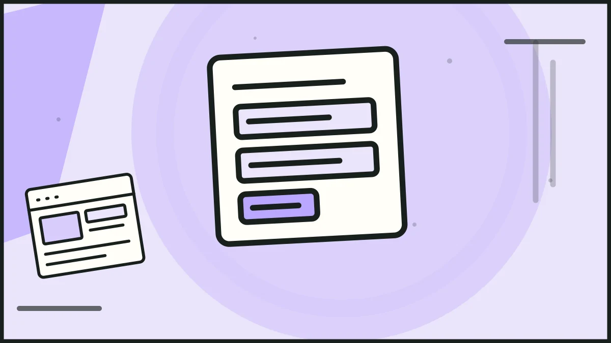
A usable website form asks for only what is needed, explains each field and helps people recover from mistakes. Design the whole interaction, including the error and confirmation states, rather than treating the form as a row of boxes beneath a page.
Begin with the purpose of the form
Write down what the organisation needs to do after submission. An initial enquiry may require a name, contact method and short description. It may not need a full postal address, budget or telephone number. Every extra field should have a reason that helps the next step.
If the form is long, group related questions and explain how long completion may take. Save progress where the task is substantial and that is practical to support. Show which fields are required before the visitor starts typing.
Use labels and help text that stay clear
Place a visible label with each input. A placeholder can offer an example, but it should not be the only label because it disappears when someone enters information. Explain unusual formats, such as an account reference, near the field where the explanation is needed.
Choose input types that suit the answer, especially on a phone. A date field, selection control or text area should be tested with realistic users and data. Do not force a complex answer into a tiny single-line input.
Make errors actionable
When a submission fails, preserve the information already entered where safe and tell the visitor exactly what needs correction. Put the message near the affected field and provide a clear summary for longer forms. Colour alone should not carry the error.
Validate what matters rather than rejecting harmless variations in names, telephone numbers or addresses. If a field has a length or format requirement, state it before submission. A guide to useful form error messages can help teams write the difficult states.
Explain the outcome and test it
The submit button should name the action, such as "Send enquiry" or "Book appointment". After submission, confirm what was received and what happens next. If the form sends an email, check that the message is delivered and that the visitor sees an appropriate confirmation even if the notification fails.
Test the form on a phone, with keyboard navigation and with intentionally wrong or missing answers. A form that looks tidy in the default state can become confusing when the keyboard opens or an error pushes content down the page.
Frequently asked questions
How many fields should a contact form have?
Use the fewest fields that let the team respond appropriately. The right number depends on the task, but each required field should have a clear purpose.
Should we mark optional or required fields?
Yes. Make the rule clear and consistent before a visitor submits the form. Do not require information only because a template includes the field.
Is a single error message at the top enough?
For a short form it may help, but the affected fields also need clear guidance. People should know where to go and how to correct each issue.
HELP US IMPROVE
Was this article useful?
Your feedback helps shape future coverage.