Date-picker visual design: show the date and the available choices
Plan date-picker visual design with distinct selected dates, readable month controls and clear unavailable days, then check the calendar alongside the date input.
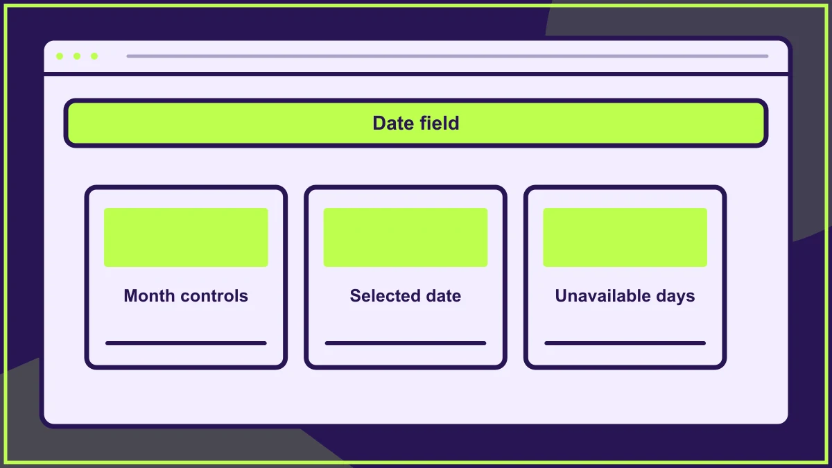
Date-picker visual design should help a visitor identify the date they want, understand which days are available and confirm what they have selected. Keep the calendar's states distinct and its month controls easy to locate. Design the associated date field as part of the same interaction, so opening a calendar is an aid to choosing rather than an obstacle someone must overcome to enter a date they already know.
Match the calendar to the kind of date
Choosing an appointment next week differs from entering a date of birth decades ago. A small month-by-month calendar may suit the first task and make the second unnecessarily laborious. Begin by identifying the likely distance from today and whether people need to compare adjacent days.
For a known date, make the input method clear and show the expected format. For an availability task, a calendar may communicate the pattern of open days more effectively. The design brief should state which problem the component solves. This belongs within the wider online booking journey, while the visual review concentrates on the field, panel and their connection.
Give each date state a different visual meaning
A calendar can contain today's date, a selected date, a date under keyboard focus and unavailable dates at the same time. Do not use the same filled circle for every state. Someone should be able to identify their choice even when focus moves elsewhere.
For example, a selected date might have a strong filled shape, today a modest outline and focus an additional visible ring. The exact styling should fit the brand, but the meanings must remain distinguishable on the final background. Avoid relying solely on red and green, or solely on a difference between two similar tints.
If dates outside the displayed month appear in its grid, make that relationship legible. Their treatment should not suggest they are unavailable if they are actually selectable dates in the neighbouring month.
Make the panel readable before making it compact
Place the month and year where they remain visible while people use the navigation controls. Use clear previous and next controls with enough room to operate them. A delicate arrow floating far from its heading may look elegant in isolation and become difficult to understand in a busy booking panel.
Align date columns consistently beneath their day headings. Keep enough space around date targets that the selected state and focus treatment do not merge into the next cell. Review the layout with larger text rather than shrinking every element to maintain the original panel width.
Use your existing brand colour and contrast decisions to define the palette, then inspect these small states specifically. A colour that works in a large banner does not necessarily produce a clear calendar marker.
Explain unavailable days without creating a guessing game
A hypothetical venue booking form might allow appointments only on certain weekdays. Show a short explanation near the calendar rather than leaving visitors to infer the rule from a field of pale numbers. When different unavailable dates have different reasons, decide which distinctions genuinely help someone choose.
Do not promise that a date is booked merely because it cannot be selected. It may be outside the booking window or unavailable for the selected service. Keep the interface's wording consistent with the real availability information it receives.
If changing the service changes the available dates, keep the selected date visible until the interface can confirm whether it remains valid. Explain any necessary correction beside the affected field instead of silently replacing it with another day.
Keep opening, choosing and closing coherent
The calendar should appear beside the field it affects without covering the instructions needed to use it. On a narrow screen, a differently arranged panel may be clearer than a tiny desktop calendar squeezed into place.
After selection, show the chosen date unambiguously in the field. A visitor returning to change it should find that date represented in the calendar. Agree how cancelling works so closing the panel does not unexpectedly commit a tentative choice. Implementation must also handle keyboard focus and assistive technology; a visual prototype alone cannot establish that the finished interaction works.
Include this behaviour in the design quality assurance checklist, using the actual component rather than screenshots. Test the edge of the booking window and a previously selected date that becomes unavailable.
Frequently asked questions
Do we need a bespoke calendar for a branded website?
Not necessarily. Review the available native or established component with the real task before commissioning a custom interaction. Brand treatment is useful, but a custom panel introduces states and behaviour that must be designed, implemented and tested together.
Should unavailable dates disappear entirely?
Usually people still need the calendar's structure to understand where they are. A visible unavailable day can preserve that structure. Make its state clear and explain relevant availability rules without requiring a visitor to attempt every date.
What should a date range look like?
Distinguish its start, end and intervening days without making the whole period look like separate selections. Show both dates in a clear summary. Test an incomplete range and a range crossing a month boundary before accepting the visual treatment.
HELP US IMPROVE
Was this article useful?
Your feedback helps shape future coverage.